CineChroma Devlog 02 — Running It on Everything
The Batch
The tool works. That was devlog 01. The obvious next question is: what happens when you run it not on one film but on everything? I have a hard drive of films — about 75 titles spanning 1952 to 2026 — and I wanted a pipeline that would chew through all of them without me babysitting each one.
I wrote a small throwaway batch runner — not part of the CineChroma repo, just a script
that discovers every video in the directory (handling mixed flat and nested folder structures,
because real film libraries are never clean) and calls the four existing CLI commands in
sequence: extract → analyze → render strip → render palette. Skip any film that already
has an analysis.json. Log everything to a
file. Continue on failure.
It discovered 75 films and started running alphabetically. I stopped it midway — 20 films completed, one failed (a codec issue), and the rest are queued for the next run. Each film takes roughly 5–8 minutes at 1-frame-per-2-seconds sampling on a 2-hour runtime. That is not fast, but it is unattended, which is the only thing that matters.
What the Outputs Actually Look Like
Each film produces two files: a color strip — a horizontal timeline where each vertical line is the dominant color of one frame — and a palette grid split into four luminance bands: light (L > 70), medium, dark (L ≤ 30), and overall. The strip is the interesting one. It compresses an entire film into a single image. You can read it like a waveform.
12 Angry Men (1957)
The strip is almost entirely a flat grey. Near-monochrome, wall to wall. It is a 1957 film shot in black and white, and the tool confirms it — the entire runtime lives between deep charcoal and light ash. There is one tiny amber flicker in the first few frames, probably the brief exterior courthouse shot before the men enter the jury room. After that: grey.

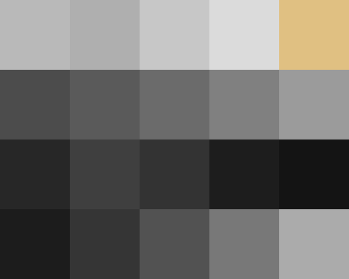
12 Angry Men (1957) — colour strip + luminance palette
This was actually a useful calibration check. The pipeline handles B&W films correctly. It does not hallucinate colour. It reports what is there.
Chinatown (1974)
The palette is a remarkable example of restraint. The light band is all muted sage and silver-green. The medium band is warm earth — tans, dusty khakis, dark olive. The dark band drops into slate blue and nearly-black brown. There is almost no saturated colour anywhere.

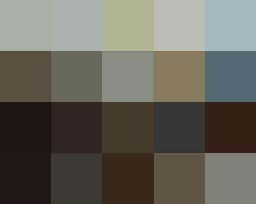
Chinatown (1974) — colour strip + luminance palette
The strip bears this out. It is a long, unbroken field of dark brown and near-black, with occasional cold blue-grey intrusions. Those blue flashes are likely the few outdoor daytime scenes or the final shot. Everything else is shadow. Polanski and Alonzo kept the film in dirt and shadow for nearly the entire runtime, and the barcode makes that choice impossible to miss.
Eyes Wide Shut (1999)
This one surprised me most. The strip is warm amber and burnt sienna in the first third — that is the domestic scenes, the Christmas-lit apartment, the party at Victor Ziegler's house. Kubrick lit everything with practical warm sources and it bleeds all the way through.

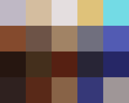
Eyes Wide Shut (1999) — colour strip + luminance palette
Then, roughly a third of the way through, a band of deep blue-purple appears and persists across a significant stretch of the timeline. That is the Somerton mansion sequence — lit in cold blue-silver and violet, it is the single most tonally distinct section of the film. The palette's light band confirms it: gold-warm and aqua-cool coexist in the same film — two worlds with completely different colour temperatures, never reconciled.
The dark band in the palette picks up deep maroon and near-black navy — the spaces between those two worlds. The overall palette is surprisingly rich for a film that feels monolithic when you are watching it.
Dune (2021)
The strip is the most structurally legible of the batch. You can read Arrakis in it. There are recurring vertical bands of deep burnt orange — bright, sharp, almost fluorescent against the otherwise dark baseline — that correspond to the open desert scenes. That is the spice. That is the sand. Those bands are not subtle.

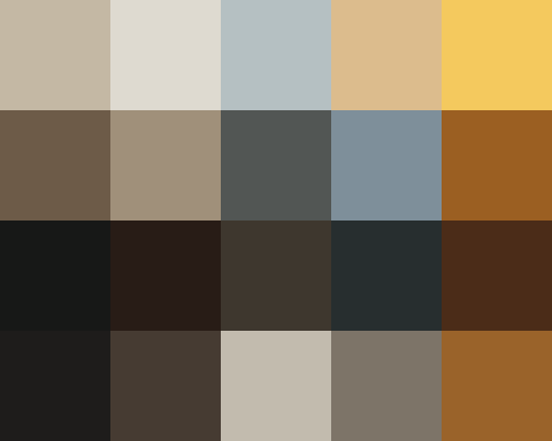
Dune (2021) — colour strip + luminance palette
The overall palette is otherwise extremely dark — Villeneuve and Fraisse desaturated everything and graded it towards grey-brown. But those orange spears keep breaking through the strip at regular intervals. The palette's medium band is essentially a map of Arrakis: warm amber-sand punctuated by deep slate.
Everything Everywhere All at Once (2022)
The strip has three visible acts, which is not something I expected to be able to see directly. The left section is dark olive-green and muted teal — the mundane laundromat and tax office scenes. The middle section goes very dark, almost black in places — the nihilistic alternative universes, the void sequences, the bagel. The right section brightens significantly, shifting towards softer blues and whites.

Everything Everywhere All at Once (2022) — colour strip + luminance palette
The film's emotional arc is literally readable as a change in luminance across the timeline. It goes: muted → dark → light. That is the story, compressed into a single horizontal image. The palette's light band has a distinctive blue-grey that sits at the cooler, calmer end — the "everything is okay" frequencies.
The Bigger Idea
Running it on 20 films is a demo. The interesting version is 1000.
If you take roughly one popular film per week going back 70 years and run this pipeline on all of them, you end up with a database where each film is represented as a colour feature vector — mean colours, variance, brightness curve over time, palette by decade — and now you have something you can actually query. Not just look at.
A few things I think are genuinely findable in that dataset, not speculatively but as engineering problems:
- The teal-and-orange problem, precisely dated. The shift towards high-contrast orange-teal grading in Hollywood blockbusters is well known anecdotally. In a colour dataset you can find when it actually started, which studios adopted it first, and whether it has peaked or is still climbing.
- Director fingerprints. Strip averages cluster. Kubrick's dual colour temperature is visible in one film — in ten it becomes a signature. Wes Anderson's tight, saturated pastels against flat grey-greens would be statistically separable from anything else in the dataset. Fincher would sit in a corner by himself.
- Visual pacing without watching the film. A smooth, slowly varying colour strip versus a chaotic noisy one encodes editing rhythm. You can quantify "intensity per minute" from frame-to-frame colour distance alone. That is a metric for tension that asks nothing of narrative.
- Outlier detection that surfaces underrated films. Films that sit far from the centroid of their genre cluster are visually unusual. Those are often the cult ones, the experimental ones, the ones that time has been kind to.
What will not work: expecting the dataset to tell you something deep about narrative or meaning. Colour is a visual signal, not a story. But colour as a style signal — as a proxy for intention, era, and craft — is surprisingly dense. The 12 Angry Men strip is entirely grey and that is not an accident. The Dune strip has those orange spears and that is not an accident either. Someone made that choice, and the data records it.
What's Next
The immediate next step is finishing the batch. 55 films left to process. After that:
- Attach metadata. Year, director, decade, region. Without it the outputs are orphaned files. With it they become a queryable dataset.
- Build a comparison view. A single page showing all strips side by side, sortable by year, so you can actually see the colour history of cinema visually rather than have to imagine it.
- Turn the analysis.json into feature vectors. Mean Lab values per film, luminance variance, palette diversity score. The kind of numbers you can feed into a clustering algorithm and get something back.
The film history angle is still speculative. But the Dune strip convinced me it is worth finding out. Those orange bands should not be that legible. They are.